Available for Purchase.
"*" indicates required fields
This submission is an inquiry of availability and details but does not guarantee a sale. Thank you for your understanding.

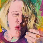
Liz Hager, 20241007 Acrylic and water-soluble media on panel, 11 x 14"
As I looked through my portfolio recently I was struck by an extensive reliance on orange hues. As far back as I can remember I’ve had a natural affinity for the orange. Perhaps, as I am an October baby, it’s to be expected. Nevertheless, it’s hard to think of a color that better represents the fantastic bits of the world as I experience it.
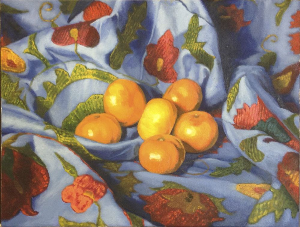
Certainly I gravitate towards orange vegetables and fruits—among all those (often bitter) greens, carotenoids are a welcomed stimulate to the eyes not to mention sweet on the palette.
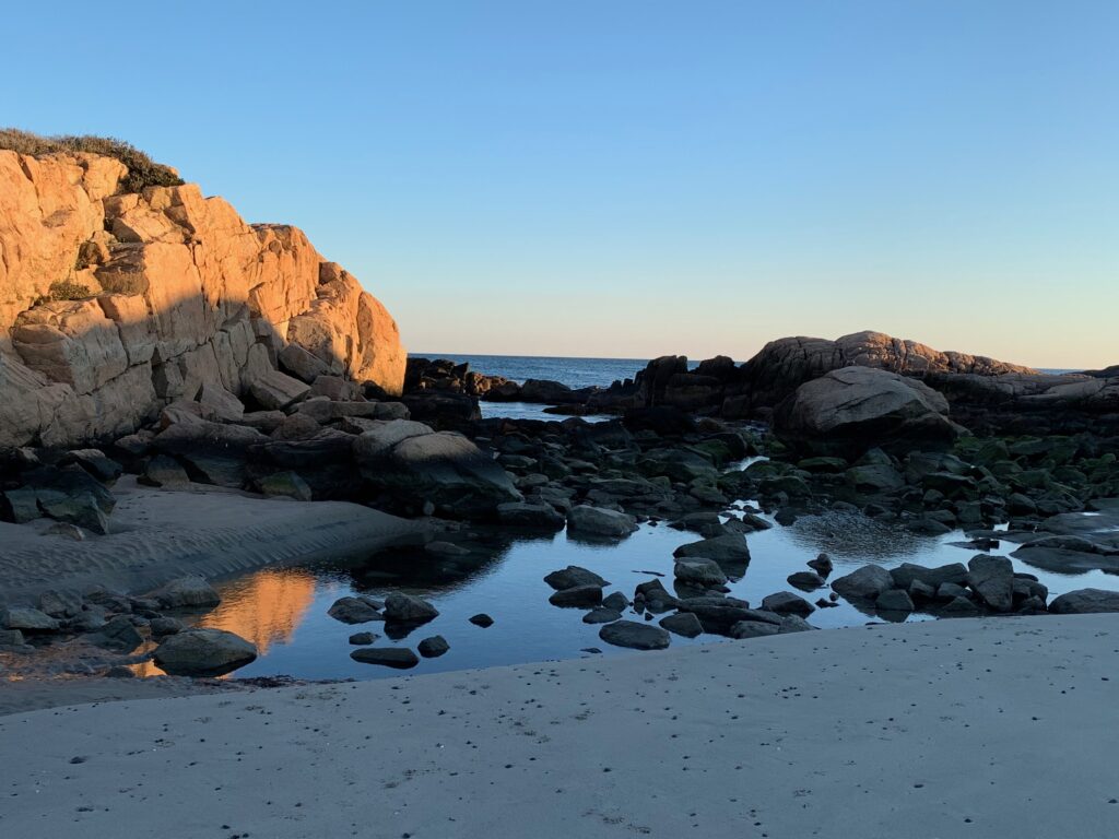
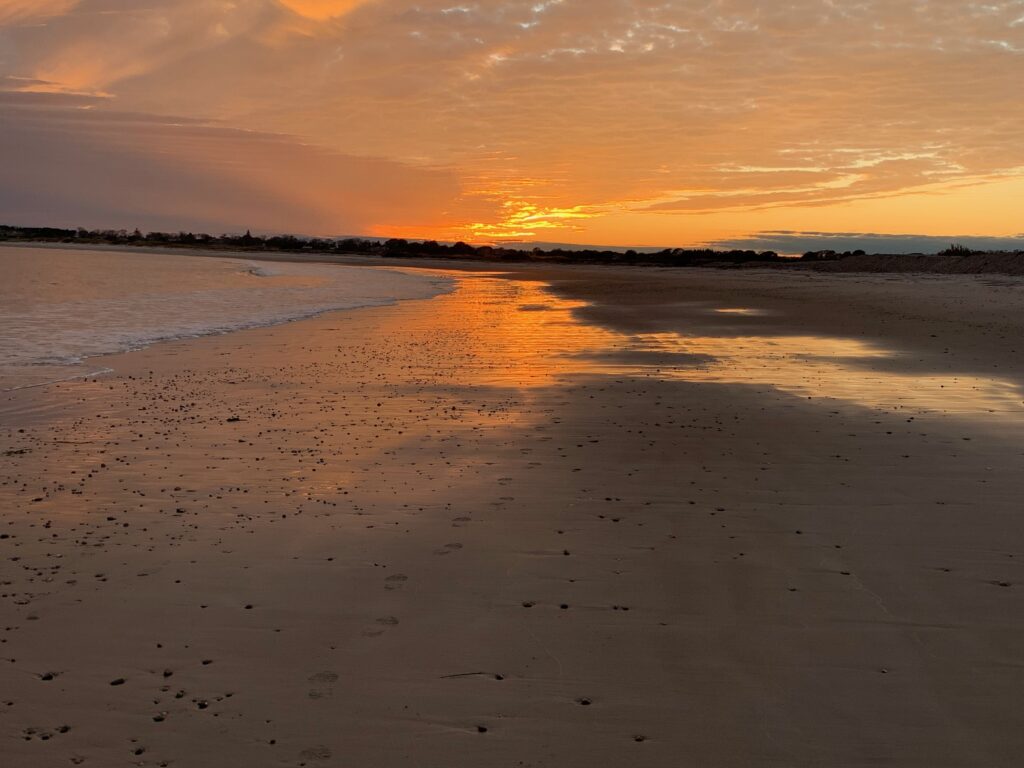
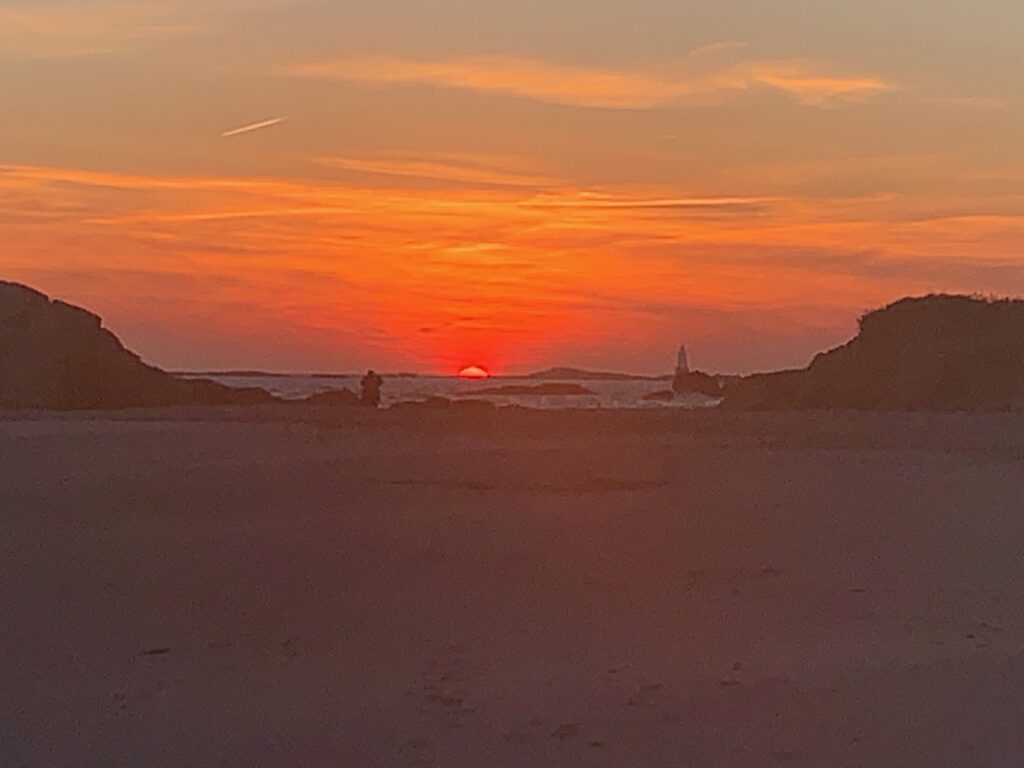
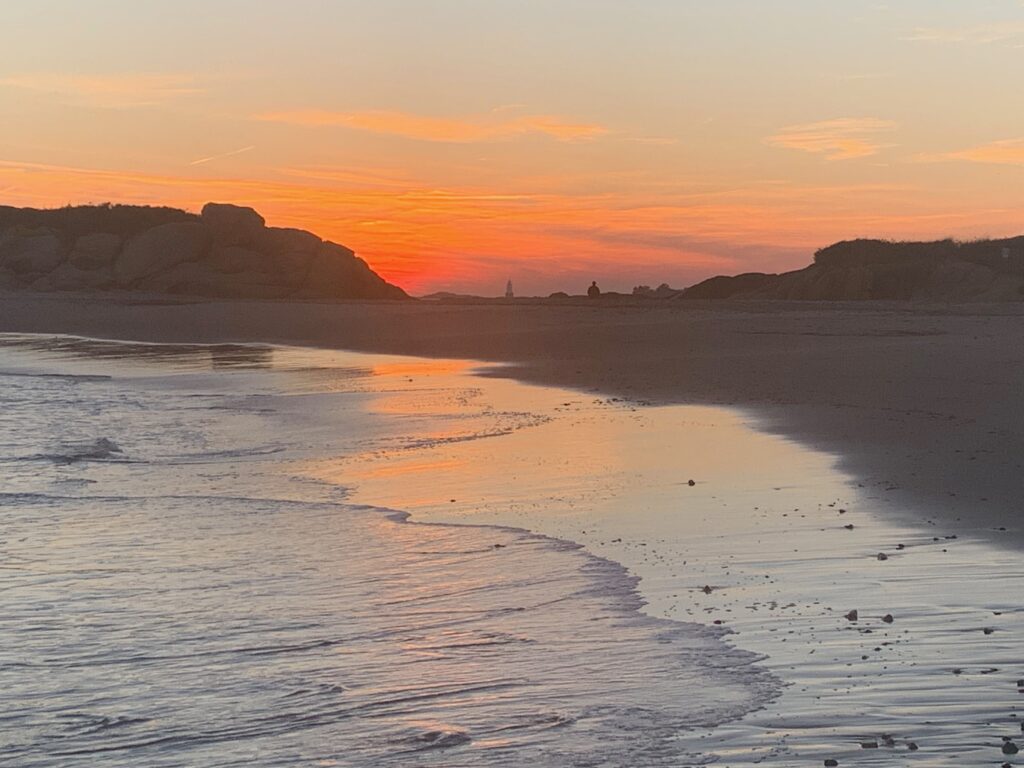
More important to my visual experience, orange informs the bookends of Earth’s day. As I see it, there is nothing more consistently spectacular than fall sunsets on the Rhode Island coast (where I am lucky to spend several blissful weeks after Labor Day).
Because the fall sun sits lower in the sky, its rays must travel through more atmosphere. In doing so, they scatter the sky’s blue light waves, which allows the longer wavelengths—reds, oranges, and yellows—to dominate the atmosphere. Vivid colors=this painter’s delight!
As for the capturing of those vivid colors on canvas, we haven’t always had practical orange pigments. Apparently before the 16th century, there was no English word for the color orange —it was referred to as yellow-red or simply red. Indeed, many fairly decent shades of orange can be arrived at by mixing red with yellow pigments. But but pure orange pigment is resplendent!
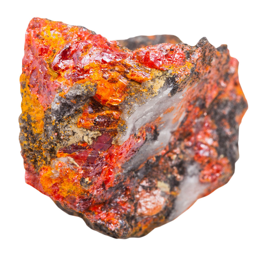
Before 1809 and the advent of the synthetic pigment chrome orange, orange pigment was derived from the highly toxic mineral realgar (also known as ruby of arsenic!). It was used for centuries in Chinese, Central Asian and Egyptian art. Turns out all those gorgeous orange day lilies in 17th century Dutch floral still lives were rendered in lethal substance.

Happily today painters can choose from a number of synthetically produced oranges. Since I have eliminated cadmium paints from my palette (due to toxicity), my go-to oranges include pyrrole (PO73), and pennone (PO43). Both tend towards red, so I end up mixing with Azo or Diarylide Yellow to get the warmer tones.
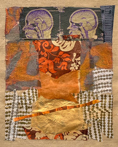
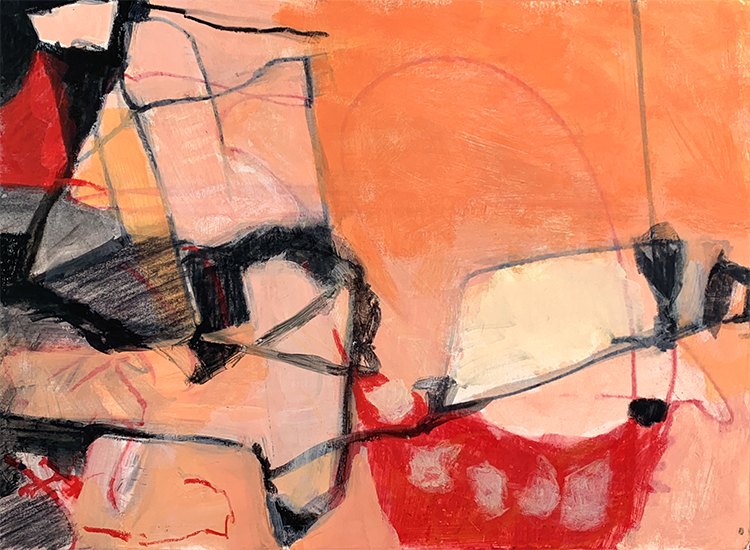
If my canvas is a room where shapes congregate to converse, then orange gives these chattering forms their most distinct personality—arresting, impossible to ignore; warm and welcoming, if a touch brash; ever optimistic; flexible and adaptable, a necessary trait, as life on my canvases is always in flux.

What I relish most about orange is the way it changes personality when mixed with other colors. Add a touch of black or grey, and it settles into the grounded stability of brown. Mix in magenta and the crackle of electricity! Temper it with ochre and the cheekiness softens. Pair it with blue and voilà, a rich eminence grise emerges.
All that said, Kandinsky captured it most poetically when he observed: “Orange is red brought nearer to humanity by yellow.”


Ha,ha,ha. I always enjoy your posts but this one was so timely. I went for a nice long walk today and saw some lovely yellows and oranges. And a gorgeous sunset sky that reminded me of LC! I’ll have to send separately.
Any and all flaming orange sunsets gratefully accepted!
Thank you for inspiring me to ask Perplexity about the significance of the color orange — something I’d never really thought about. I love your use of the color, and agree that there is something about autumn in New England that just screams orange. It also reminds me that my favorite, most desired, most coveted car when I was in my late teens was an orange Saab 99. Unfortunately I never had one, and Saab was a dying breed by the time I was able to buy a car of its class. And I ramble, always inspired by your comments. Paint on!
I certainly can appreciate your attraction to that Saab with all the connotations of the color. In a world of black, white, and silver, I say, be ORANGE!
I love both sides of your work but as a realist, I really love the still life.
I used to teach color theory for designers. I of researched better exercises, and found a starter exercise— to figure out what your favorite go-to colors are (and what your least favorite colors are).
Because many of us are unaware.
Maybe not a problem for fine artists but for designers, who are working for clients, it’s something they need to know about.
My favorite turned out to be raspberry. No surprise there!!
Thanks Carolyn! I spent a number of years beginning in 2010 building my ability to depict the world “out there.” Now that I am along the path of abstraction, I realize how much harder it is to master decently. My paintings are all about forms conversing, so shape and color are stand ins for personalities. I suspect orange must bring out certain sides of my personality!
I appreciate your comment that many people are unaware of their favorite colors. Abstraction tends to highlight that for people—i.e. when there’s “nothing to see,” color becomes that much more important to viewers. I suspect they often don’t “like” an abstraction, because on some level they don’t like the colors. At some point, I’m going to post on GREEN, the most problematic color for me…
Orange is a color of emergency and energy! It’s urgent! It’s also my favorite color, and I love seeing it in your beautiful abstractions.
I completely agree with you about urgency and energy; it’s like the color confidently says LOOK AT ME NOW! I also appreciate the gauntlet orange throws down—PROCEED with CAUTION! And finally makes me very happy that my abstractions resonate with you!
I love this story of orange! Very early in my painting journey I did a very large self portrait with very large boobs (which, as you know, I don’t have), the torso using almost an entire 150ml tube of cad orange. I don’t know what inspired that – the attraction to orange i guess. Which I still have. thanks for bringing it back to life FAB!!
Twas my pleasure! Orange seems to have elicited quite a response among the Creative Briefs crowd, so happy I could bring us all together for memories and appreciation!
This from a reader not on WordPress system: Orange for me goes as far back as my first Farm League Baseball uniform [age 5-7] when a “uni” was just a tee shirt … but our team color was orange. And on late Saturday afternoons or early evening games, those shirts sang in the sun or under the lights.
Do I recognize Venice beach – wonderful photos and artwork.