Available for Purchase.
"*" indicates required fields
This submission is an inquiry of availability and details but does not guarantee a sale. Thank you for your understanding.
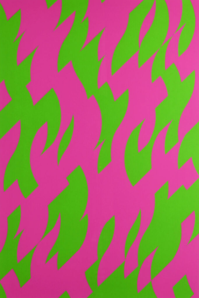
WARNING:This post contains high contrast patterns and may not be suitable for those with photosensitive epilepsy.

Several years ago, I unknowingly juxtaposed vermilion (reddish orange) with a turquoise akin to cyan in a sketchbook experiment (above). Within seconds, the image disturbed my visual field so profoundly that I had to look away.
Why should these two together have had such a powerful visual impact?
Red and green are among the most dynamic and emotionally charged colors in the spectrum. As complementary colors—positioned directly opposite each other on the color wheel—they can, in the right hues, produce one of the most intense contrasts available to a painter. When placed side by side, this contrast can be so strong that it creates a perceptual vibration, one that, in some cases, becomes overwhelming to the eye.
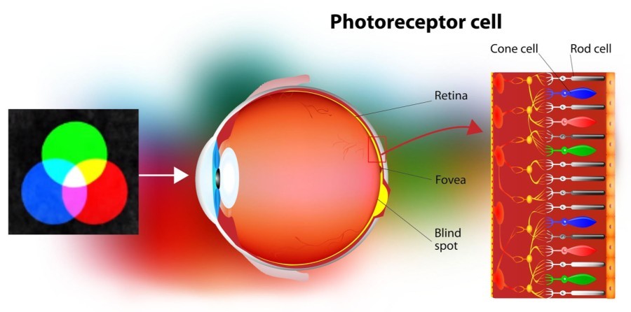
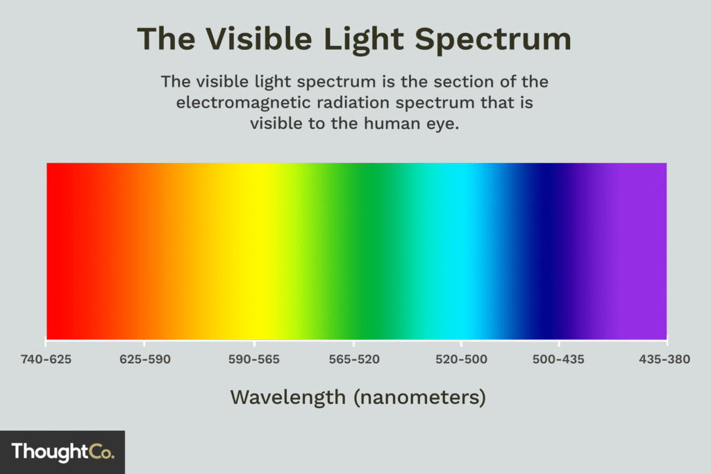
Red has the longest wavelength of visible light and stimulates the retina’s long-wave receptors. Turquoise lies at a much shorter wavelength and primarily activates the medium-wave receptors. Although the human visual system is finely tuned to process a wide range of information, the juxtaposition of such disparate wavelengths can overwhelm it. The result is often a flickering or vibrating sensation—an optical interference pattern that our brains struggle to process. Immediate retinal dissonance!
Additionally, when colors approach fluorescent (neon) territory, as these two do, the high saturation makes them seem even more vibrant, thus stimulating the visual system to an even greater degree.
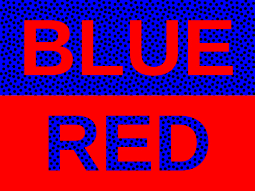
Also at work was a phenomenon known as chromostereopsis—a visual illusion in which colors of differing wavelengths on a flat surface appear to have depth. The effect is especially pronounced when the colors are highly saturated (pure untainted) and placed in close proximity.The brain has trouble reconciling this illusion and stabilizing the vibrating image. Your overloaded brain tells you to stop looking.
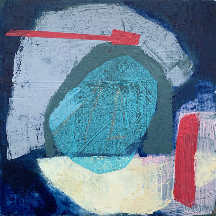
Since then I’ve mostly avoid the vermilion-cyan combination. Although I have used it on occasion, It is really tricky to find the right balance and modulation.
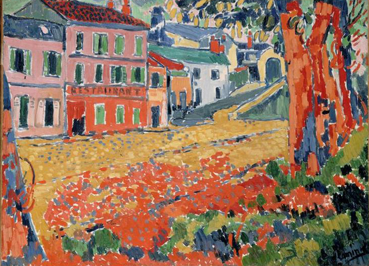
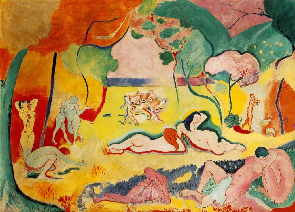
In The Joy of Life, Matisse uses warm red and blue green, but he pushes the green into deeper, more subdued tones, reducing the vibrancy and, with it, the visual tension. Vlaminck, in works like The River Seine at Chatou, similarly tones down his palette, using earthy greens against warmer reds to create contrast without chaos.
On the other hand, Bridget Riley takes the opposite approach. The very purpose of her work is to disorient and stimulate through color and form. She’s masterful at this.
Though I’ve made some color jarring paintings in my day, my overarching desire to engage, not overwhelm my viewer. I’m most interested in a color scheme that vibrates with energy, but allows the viewer to settle in for a long look. If I choose to use vermilion and turquoise together at least let me put some space between the antagonists.


Thanks, I was trying to explain how difficult it is to see red and green together, to a friend who insisted it was a bad reaction to Christmas. Thanks for clear explanation and terrific examples!
Happy to be of service my friend!
What a great piece of writing on a great topic. I love how you led me into the process. Your painting is amazing.
so pleased you got something out of this post and really appreciate that you took the time to comment!
Brilliant and accessible
Mr wizard and Mr Rogers
Bravo
Appreciate that you took the time to read and comment! But, is Mr. Rogers who I think he is????
Thank you so much for the most interesting lesson! It was much pleasanter to wake up to than the news, too.
C
Art (aka creative impulse) is an antidote for destruction!
Wonderful topic, superbly illustrated! Thank you, Liz 🙏
Many thanks Sarah for adding to the conversation. Always gratifying to hear from readers!