Available for Purchase.
"*" indicates required fields
This submission is an inquiry of availability and details but does not guarantee a sale. Thank you for your understanding.
This is the second of a two part series. Seeing Red: Part 1.
The ‘pure’ red of which certain abstractionists speak does not exist. Any red is rooted in blood, glass, wine, hunters’ caps and a thousand other concrete phenomena. Otherwise we would have no feeling toward red and its relations…
—Robert Motherwell
My mother warned me to avoid things colored red.
—Claes Oldenburg
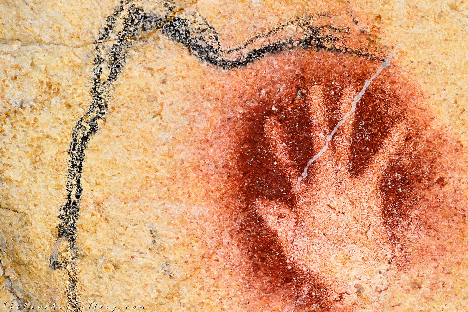
Painters have been using red since the beginning of recorded history. Red (from the Sanscrit rudhira for blood) was first basic color term added to languages after black and white. Forty thousand years ago the cave painters of Altamira used red certainly because hermatite-infused clay was a readily available painting material. But surely the color connected them symbolically to the animals they depicted—sacrifice, blood shared.
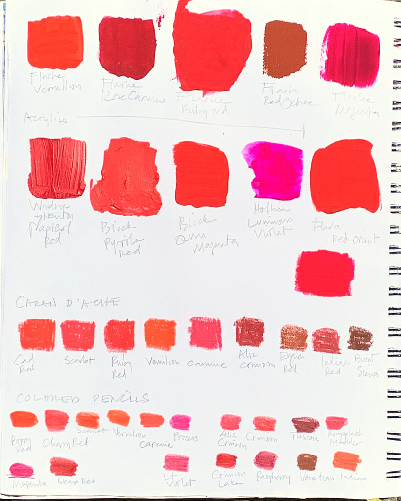
Cinnabar (mercury sulfide), another ancient pigment, has used by cultures around the world since as early as the 10th millennium B.C. Confusingly, ancient cinnabar was often referred to as “vermilion,” different from modern vermilion. The Egyptians used both hematite and cinnabar extensively to decorate their walls and color their bodies. The Greeks colored their mosaics and statues with this red.
Cinnabar was expensive to produce. Well-to-do Romans deployed it all over the frescoed walls of their villas, creating a lush and theatrical visual experience and would have boldly reinforced the owners’ prestigious position.

Recognizing the emotional impact of red, Christians in turn adopted the color and enhanced its symbolism. Red could be considered evil (associated with the flames of hell, Satan, the spilling of blood) or good (i.e. the burning bush, The Holy Ghost, the blood of life). Red made from cinnabar was front and center In the iconography of Christ (and by extension Mary and the Apostles).
(Aside: Cardinals’ cassocks were actually dyed a scarlet hue, which was derived from New World cochineal insects. Someone confused the world by naming another red hue after the priests vestments.)

Cinnabar was used extensively by the Chinese for their lacquerware and by the Incans for funereal masks.
Paradoxically, cinnabar (mercury sulfide) is at once dazzling and highly-toxic.
Another toxic substance, minimum, or red lead, was so popular with Medieval manuscript painters and later Mughal artists that their paintings became known as “miniatures, ” after the painted accents of minimum. The word minimum in turn derives from the Latin miniare, “to paint red.”

To replace cinnabar, enter cadmium red, a warm and opaque red. Through a chemistry discovery in the early 19th century, the substance gradually came Into use, though not commercially until the early 20th century. Though cadmium is a toxic metal, the amount of soluble cadmium in pigments is so low as to be classified as non-toxic. So cadmium red has remained in the painter’s palette.
Turner, the master pigment experimenter, used Chrome Red, or Scarlet Chrome, which turned out to be highly fugitive (Windsor & Newton dropped the color in 1842) and at least one red lake pigment (strictly speaking lakes are dyes not paints).

With The Red Studio (1911) Matisse secured a first toe-hold on the climb that would culminate in red as its own subject of a painting. Though he was enamored of cadmium red, for this painting he chose Venetian Red, a red ochre originally mined near Venice. As bold as the color is, curiously the flatness of its application unifies rather than overpowers the other elements in the painting. Critic John Russell nailed it: “Color is on top, and making the most of it.”
Red may have been the right technical choice (imagine same painting with some other color), but I wonder also about the emotional component. Was Matisse signaling through red an equation, the artist’s studio as sacred space?

Kandinsky provided another step on the path toward the liberation of red (and painting) from the observation of external reality. The painter believed that all colors had a spiritual component, that they evoked psychological, physical, and emotional responses. He considered red “restless, glowing, alive, manly maturity.” He is known to have used cinnabar and PR60 (magenta).
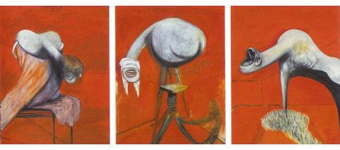
In 1944 during a frenzied 2-week period Francis Bacon produced Three Studies for the Base of a Cruxifiction. Though he drew inspiration from Grünewald (as well as Matisse?), fittingly he blew up traditional Christian iconography. The piece speaks to a thoroughly modern world, already five years into another world war.
In 1948 Philip Guston offered another milestone that would liberate color from strictly describing form. What references to objects exist in Red Painting are fading fast into a carmine miasma.
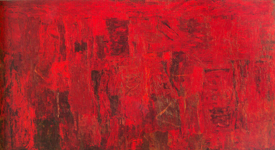
In 1969 Rothko pushed all the way through the frontier, allowing red to be a pure emotional experience untethered to objective reality.
%20in%20Detail%20Mark%20Rothko.jpg?ezimgfmt=rs:848x1323/rscb1/ng:webp/ngcb1)
Contemporary painters have many traditions to draw upon, which turns out to be a blessing and a curse. (What new things can be said with red?)
In Conference figurative painter Alex Kanevsky gives red a lot of canvas real estate, but subtlety offsets it with blue-tinted white background and blocks of black, tried and true palette companions to red. In subject matter and use of color the painting contains the faint echo of Lautrec and Boris Griegoriev brothel scenes.
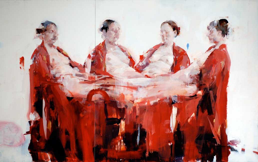
Today, with a few exceptions, the color red is largely relegated to the ceremonial sphere. (Even reliably red fire engines are no longer always red.) So, in our predominantly blue and green world, when we spy a splash of red, It startles and even assaults us, albeit not always in unpleasant ways. Its vibrancy reminds us of the color’s emotional and symbolic associations, which we may have forgotten, but are deeply embedded in our cultural DNA.
Artists intuitively understand this potency.
Miniature Paintings of the Mughal Empire
Peter Schejldahl: “The Immersive Thrill of Matisse’s ‘The Red Studio'”
[cool_tag_cloud on_single_display=”local”]

Seeing red: The cross, my bleeding heart, the badge of courage, Hester Prynne, a brothel, the district, fire truck, little riding hood, the tent, mars, one fish two fish, the pony, orhans name, valentine, Santa, danger, rage, lust, Sunday, communist, republican, blush, the Fort, Boston Sox, root chakra, STOP