Available for Purchase.
"*" indicates required fields
This submission is an inquiry of availability and details but does not guarantee a sale. Thank you for your understanding.

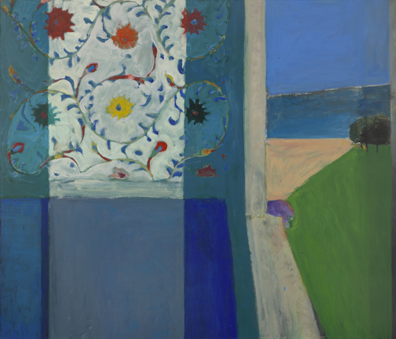
Richard Diebenkorn, Berkeley #571955 © The Richard Diebenkorn Foundation
Mistakes can’t be erased but they move you from your present position. —Richard Diebenkorn, from “Notes to myself on beginning a painting”
To me there is no painter who more evocatively captures the essence of the California landscape than Richard Diebenkorn. Through a palette that embraces both intensity and subtlety—bright greens and oranges, warm pinks, yellow ochers, cool muted blues, purples, turquoises, and greys—Diebenkorn creates landscape abstractions which manifest the polarity of this Bay Area environment—the intense California sun playing across grassy mountainscapes, and the often cascading fog, which mysteriously shrouds without concealing.
Richard Diebenkorn, Recollections of a Visit to Leningrad, 1965
Oil on canvas
© 2013 The Richard Diebenkorn Foundation
In the period between 1953-55, after he had returned to Berkeley, Diebenkorn painted over 50 large abstractions, and a good many of them are included in this show. The work speaks to the influence of Cézanne and Matisse, who were concerned with defining form through color rather than line. The paintings also reflect gestural elements reminiscent of Gorky and de Kooning, the latter whom he had met when he visited New York in 1946-47 and 1953. Diebenkorn synthesized all these into a sublime achievement of expression and restraint. Witness the frenetic brushwork contained by the shapes.
Diebenkorn was a fascile painter, moving easily between the abstract and figurative and there are some exquisitely elegant figural statements in the last rooms of the show. I understand the critic’s complaint about Diebenkorn forcing figures into landscapes; indeed, the more successful works for me focused on either the figure or landscape, and, in the case of the former, my favorites were the intimate works, made with gouache (and and other drawing materials) on paper.

Richard Diebenkorn, Figure on a Porch, 1959
Oil on canvas
(Oakland Museum of Art)
© 2013 The Richard Diebenkorn Foundation.
I thought it a bold choice to include many figure sketches that a more discriminating curator might have left out. Still I appreciated seeing the missteps intermingled with the stunning successes. Diebenkorn was not afraid to try different subjects and styles. Courage, mistakes can be made!
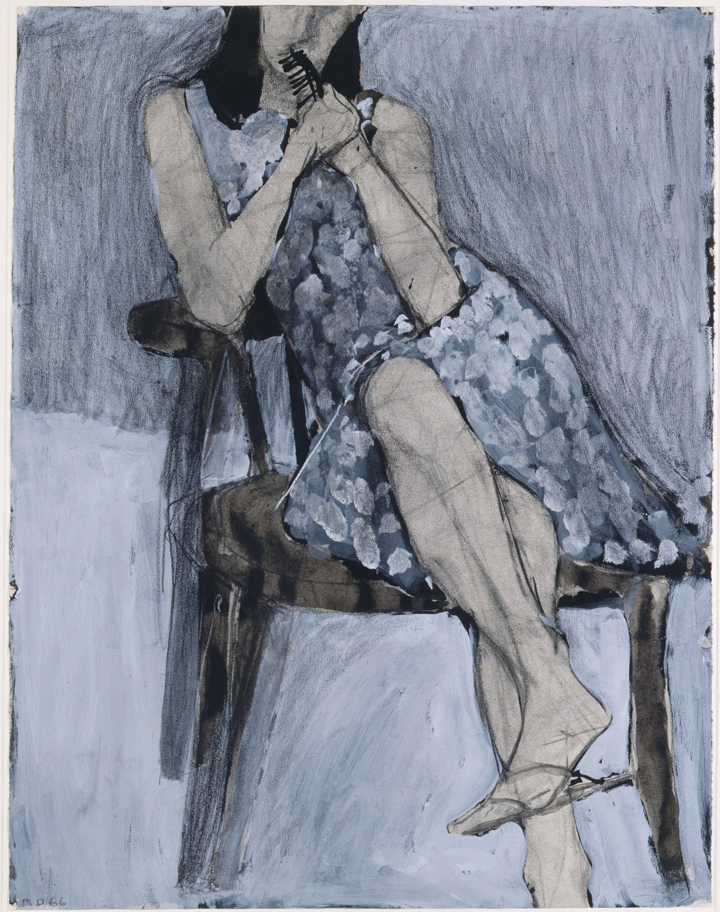
Richard Diebenkorn, Seated Woman No. 44, 1966
Watercolor, charcoal, gouache and crayon
Courtesy Fine Arts Study Collection, University at Albany, State University of New York
Still, we don’t often get to peek behind the curtain that cloaks the artistic process. “The Berkeley Years” offers an incredible opportunity to observe Diebenkorn’s relentless experimentation with underlying structure, form, line, subjects. The development of his stylistic vocabulary unfolds before us. I found this truly the most exciting aspect of the show.
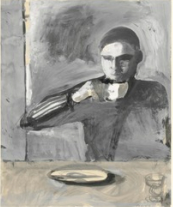
Richard Diebenkorn, The Drinker, 1957
Gouache over graphite
Courtesy Yale University Art Gallery
Top of my list of favorites: Berkeley #57. Its “plate techtonic” structure creates a forceful metaphor of the fault line. Also, Seated Woman, No. 44, for the curve of her calf (even though I’m sure the tibia is in the wrong place) and the simple treatment of the pattern on her dress. (Note to self: simplify patterns!) Figure on a Porch—I’m not bothered by the appearance of a figure, who for me becomes another abstract structural element. And finally, this gem:
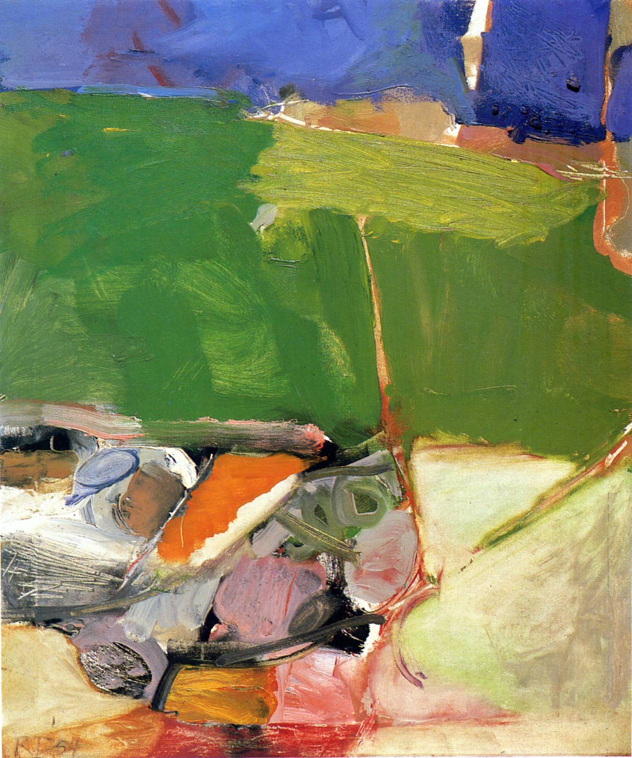
Richard Diebenkorn, Berkeley #33 , 1954
Oil on paper
© The Richard Diebenkorn Foundation
Get up close to this study to see the multitude of sensational ways that Diebenkorn uses the paint to create form and substance. See what happens underneath and in between the shapes.
One last ramble: Diebenkorn’s “Notes to myself on beginning a painting”— a good manifesto to live by or a reminder to compile your own list. (Spelling and capitalization his.)
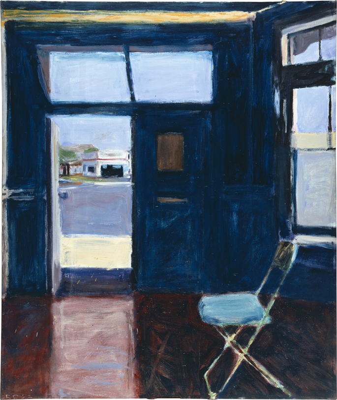
Richard Diebenkorn, Interior with Doorway, 1962
Oil on canvas
(Pennsylvania Academy of the Fine Arts)
© 2013 Richard Diebenkorn Foundation
Beyond This Post
Kelly’s Cove Press
The Richard Diebenkorn Catalog Raisonné
SF Arts Quarterly—“The Diebenkorn is in the Details”
Catalog—Richard Diebenkorn: The Berkeley Years, 1953-1966 (Fine Arts
Grace Glück—“A Painter Unafraid to Change Styles”
More California landscape—Early California Art (blog)
Paintings Of California


I’ve alway enjoyed his work. Thanks for posting.
Diebenkorn was such a wonderful colorist, though as a young figurative painter who loved his work, when he went abstract it was like jumping off a cliff. Had long loved the figurative painters John Heliker, Fairfield Porter and Jane Freilicher who stayed in the figurative vein. I don’t think any of them were as spot on as colorists as Diebenkorn. I do remember a more graphic period of abstraction that reminded me and many of landscapes, where lines and fields of color hinted at horizon lines. But I have never seen a whole show of his figurative works and sure wish I could see this show.
Tess—Stay tuned! I am working on another post about little seen Diebenkorns, mostly on paper, both abstract and figurative. Hoping to post a number of figurative drawings.
ooooh! Thanks!
I enjoyed this post and wish I could see the show. I’ve only seen these Diebenkorns in books but love the Berkeley work as well as the abstractions from New Mexico. #57 is a fabulous piece. Thanks for posting.
Great post Liz. You bring clarity to the mix of works and reactions I also had to the show. I have a few of those paintings on my imaginary wall.
Thank you so much for sharing your insights — and for the inspiration!
Thank you for a good read and some great pictures to go with it.
Liz – I just saw the show yesterday and really appreciate your comments. In total agreement but would add Berkeley #12 and #7 for exquisite layering. I also loved his little painting of Seated Man. Worth another trip if you’re interested in going again?
To me, D is about visual memory, not about representation per se – even when he does his representational work. I agree, his abstract work was unbelievable – esp. Room 2. When it comes to his representational work, what I loved to think about was, what made him feel like a work was finally finished? He leaves evidence of his process, his mistakes behind which is thrilling to see. But, what makes it “done?” Woman by the Ocean – he does 22 (or so) revisions of this which Rose Mandel captures – so, why stop there? You artists will have to answer.